BACK END/Python Library
[MatPlotLib] matplotlib 정리
circle kim
2021. 3. 2. 10:35
matplotlib : ploting library. 그래프 생성을 위한 다양한 함수 지원.
* mat1.py
import numpy as np
import matplotlib.pyplot as plt

plt.rc('font', family = 'malgun gothic')   # 한글 깨짐 방지
plt.rcParams['axes.unicode_minus'] = False # 음수 깨짐 방지

x = ["서울", "인천", "수원"]
y = [5, 3, 7]
# tuple 가능. set 불가능.

plt.xlabel("지역")                 # x축 라벨
plt.xlim([-1, 3])                 # x축 범위
plt.ylim([0, 10])                 # y축 범위
plt.yticks(list(range(0, 11, 3))) # y축 칸 number 지정
plt.plot(x, y)                    # 그래프 생성
plt.show()                        # 그래프 출력
data = np.arange(1, 11, 2)
print(data)    # [1 3 5 7 9]
plt.plot(data) # 그래프 생성
x = [0, 1, 2, 3, 4]
for a, b in zip(x, data):
    plt.text(a, b, str(b)) # 그래프 라인에 text 표시
plt.show()     # 그래프 출력
plt.plot(data)
plt.plot(data, data, 'r')
plt.show()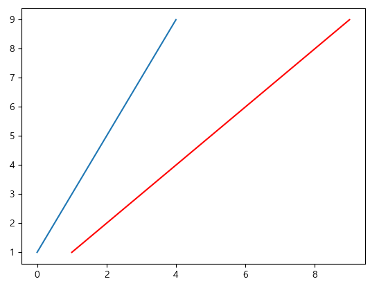
x = np.arange(10)
y = np.sin(x)
print(x, y)
plt.plot(x, y, 'bo')  # 파란색 o로 표시. style 옵션 적용.
plt.plot(x, y, 'r+')  # 빨간색 +로 표시
plt.plot(x, y, 'go--', linewidth = 2, markersize = 10) # 초록색 o 표시
plt.show()
# 홀드 : 그림 겹쳐 보기
x = np.arange(0, np.pi * 3, 0.1)
print(x)
y_sin = np.sin(x)
y_cos = np.cos(x)
plt.plot(x, y_sin, 'r')     # 직선, 곡선
plt.scatter(x, y_cos)       # 산포도
#plt.plot(x, y_cos, 'b')
plt.xlabel('x축')
plt.ylabel('y축')
plt.legend(['사인', '코사인']) # 범례
plt.title('차트 제목')         # 차트 제목
plt.show()
# subplot : Figure를 여러 행열로 분리
x = np.arange(0, np.pi * 3, 0.1)
y_sin = np.sin(x)
y_cos = np.cos(x)

plt.subplot(2, 1, 1)
plt.plot(x, y_sin)
plt.title('사인')

plt.subplot(2, 1, 2)
plt.plot(x, y_cos)
plt.title('코사인')
plt.show()
irum = ['a', 'b', 'c', 'd', 'e']
kor = [80, 50, 70, 70, 90]
eng = [60, 70, 80, 70, 60]
plt.plot(irum, kor, 'ro-')
plt.plot(irum, eng, 'gs--')
plt.ylim([0, 100])
plt.legend(['국어', '영어'], loc = 4)
plt.grid(True)          # grid 추가

fig = plt.gcf()         # 이미지 저장 선언
plt.show()              # 이미지 출력
fig.savefig('test.png') # 이미지 저장

from matplotlib.pyplot import imread
img = imread('test.png') # 이미지 read
plt.imshow(img)          # 이미지 출력
plt.show()
차트의 종류 결정
* mat2.py
import numpy as np
import matplotlib.pyplot as plt

fig = plt.figure()             # 명시적으로 차트 영역 객체 선언
ax1 = fig.add_subplot(1, 2, 1) # 1행 2열 중 1열에 표기
ax2 = fig.add_subplot(1, 2, 2) # 1행 2열 중 2열에 표기

ax1.hist(np.random.randn(10), bins=10, alpha=0.9) # 히스토그램 출력 - bins : 구간 수, alpha: 투명도
ax2.plot(np.random.randn(10)) # plot 출력
plt.show()
fig, ax = plt.subplots(nrows=2, ncols=1)
ax[0].plot(np.random.randn(10))
ax[1].plot(np.random.randn(10) + 20)
plt.show()
data = [50, 80, 100, 70, 90]
plt.bar(range(len(data)), data)
plt.barh(range(len(data)), data)
plt.show()

data = [50, 80, 100, 70, 90]
err = np.random.randn(len(data))
plt.barh(range(len(data)), data, xerr=err, alpha = 0.6)
plt.show()
plt.pie(data, explode=(0, 0.2, 0, 0, 0), colors = ['yellow', 'blue', 'red'])
plt.show()

n = 30
np.random.seed(42)
x = np.random.rand(n)
y = np.random.rand(n)
color = np.random.rand(n)
scale = np.pi * (15 * np.random.rand(n)) ** 2
plt.scatter(x, y, s = scale, c = color)
plt.show()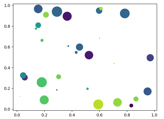
import pandas as pd
sdata = pd.Series(np.random.rand(10).cumsum(), index = np.arange(0, 100, 10))
plt.plot(sdata)
plt.show()
# DataFrame
fdata = pd.DataFrame(np.random.randn(1000, 4), index = pd.date_range('1/1/2000', periods = 1000),\
                     columns = list('ABCD'))
print(fdata)
fdata = fdata.cumsum()
plt.plot(fdata)
plt.show()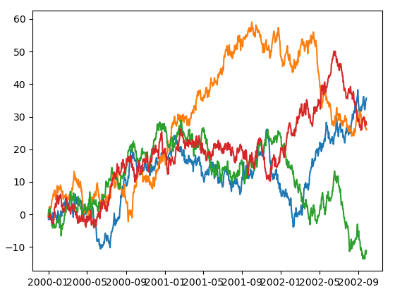
seaborn : matplotlib 라이브러리의 기능을 보완하기 위해 사용
* mat3.py
import matplotlib.pyplot as plt
import seaborn as sns

titanic = sns.load_dataset("titanic")
print(titanic.info())
print(titanic.head(3))

age = titanic['age']
sns.kdeplot(age) # 밀도
plt.show()
sns.distplot(age) # kdeplot + hist
plt.show()
import matplotlib.pyplot as plt
import seaborn as sns

titanic = sns.load_dataset("titanic")
print(titanic.info())
print(titanic.head(3))

age = titanic['age']
sns.kdeplot(age) # 밀도
plt.show()
sns.relplot(x = 'who', y = 'age', data=titanic)
plt.show()

sns.countplot(x = 'class', data=titanic, hue='who') # hue : 카테고리
plt.show()
t_pivot = titanic.pivot_table(index='class', columns='age', aggfunc='size')
print(t_pivot)
sns.heatmap(t_pivot, cmap=sns.light_palette('gray', as_cmap=True), fmt = 'd', annot=True)
plt.show()
import pandas as pd
iris_data = pd.read_csv('../testdata/iris.csv')
print(iris_data.info())
print(iris_data.head(3))
'''
   Sepal.Length  Sepal.Width  Petal.Length  Petal.Width Species
0           5.1          3.5           1.4          0.2  setosa
1           4.9          3.0           1.4          0.2  setosa
2           4.7          3.2           1.3          0.2  setosa
'''

plt.scatter(iris_data['Sepal.Length'], iris_data['Petal.Length'])
plt.xlabel('Sepal.Length')
plt.ylabel('Petal.Length')
plt.show()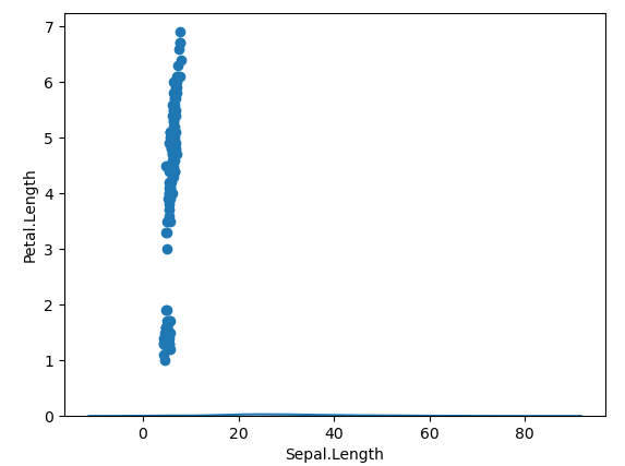
cols = []
for s in iris_data['Species']:
    choice = 0
    if s == 'setosa' : choice = 1
    elif s == 'versicolor' : choice = 2
    else: choice = 3
    cols.append(choice)

plt.scatter(iris_data['Sepal.Length'], iris_data['Petal.Length'], c = cols)
plt.xlabel('Sepal.Length')
plt.ylabel('Petal.Length')
plt.show()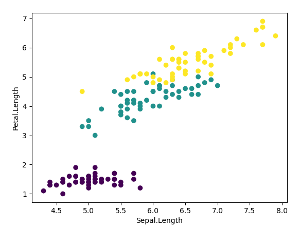
# pandas의 시각화 기능
print(type(iris_data)) # DataFrame
from pandas.plotting import scatter_matrix
#scatter_matrix(iris_data, diagonal='hist')
scatter_matrix(iris_data, diagonal='kde')
plt.show()

# seabon
sns.pairplot(iris_data, hue = 'Species', height = 1)
plt.show()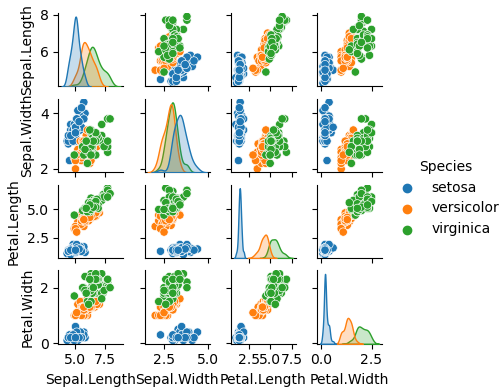
x = iris_data['Sepal.Length'].values
sns.rugplot(x)
plt.show()
sns.kdeplot(x)
plt.show()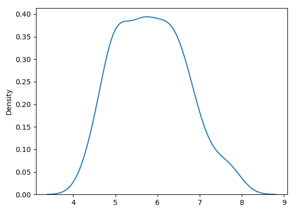
# pandas의 시각화 기능
import numpy as np

df = pd.DataFrame(np.random.randn(10, 3), index = pd.date_range('1/1/2000', periods=10), columns=['a', 'b', 'c'])
print(df)

#df.plot() # 꺽은선
#df.plot(kind= 'bar')
df.plot(kind= 'box')
plt.xlabel('time')
plt.ylabel('data')
plt.show()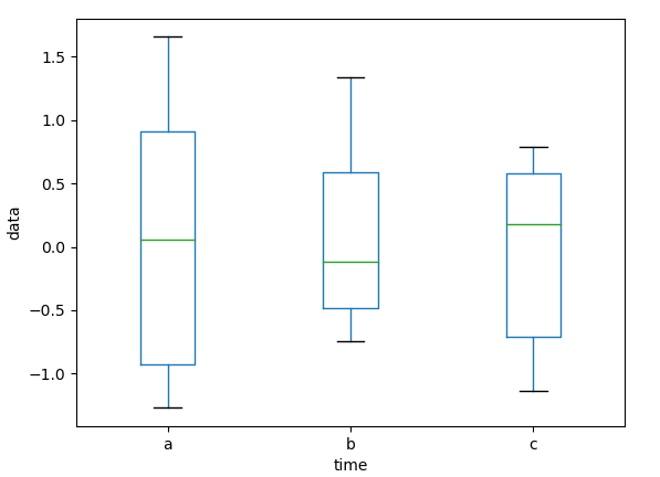
df[:5].plot.bar(rot=0)
plt.show()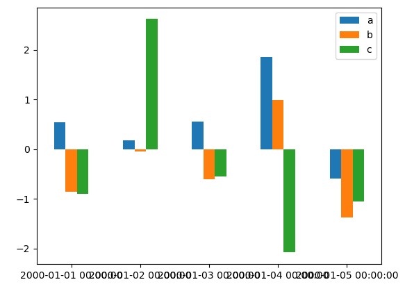
* mat4.py
import pandas as pd

tips = pd.read_csv('../testdata/tips.csv')
print(tips.info())
print(tips.head(3))
'''
   total_bill   tip     sex smoker  day    time  size
0       16.99  1.01  Female     No  Sun  Dinner     2
1       10.34  1.66    Male     No  Sun  Dinner     3
2       21.01  3.50    Male     No  Sun  Dinner     3
'''
tips['gender'] = tips['sex'] # sex 칼럼을 gender 칼럼으로 변경
del tips['sex']
print(tips.head(3))
'''
total_bill tip smoker day time size gender
0 16.99 1.01 No Sun Dinner 2 Female
1 10.34 1.66 No Sun Dinner 3 Male
2 21.01 3.50 No Sun Dinner 3 Male
'''# tip 비율 추가
tips['tip_pct'] = tips['tip'] / tips['total_bill']
print(tips.head(3))
'''
total_bill tip smoker day time size gender tip_pct
0 16.99 1.01 No Sun Dinner 2 Female 0.059447
1 10.34 1.66 No Sun Dinner 3 Male 0.160542
2 21.01 3.50 No Sun Dinner 3 Male 0.166587
'''
tip_pct_group = tips['tip_pct'].groupby([tips['gender'], tips['smoker']]) # 성별, 흡연자별 그륩화
print(tip_pct_group)
print(tip_pct_group.sum())
print(tip_pct_group.max())
print(tip_pct_group.min())

result = tip_pct_group.describe()
print(result)
'''
               count      mean       std  ...       50%       75%       max
gender smoker                             ...
Female No       54.0  0.156921  0.036421  ...  0.149691  0.181630  0.252672
       Yes      33.0  0.182150  0.071595  ...  0.173913  0.198216  0.416667
Male   No       97.0  0.160669  0.041849  ...  0.157604  0.186220  0.291990
       Yes      60.0  0.152771  0.090588  ...  0.141015  0.191697  0.710345
print(tip_pct_group.agg('sum'))
print(tip_pct_group.agg('mean'))
print(tip_pct_group.agg('max'))
print(tip_pct_group.agg('min'))
def diffFunc(group):
diff = group.max() - group.min()
return diff
result2 = tip_pct_group.agg(['var', 'mean', 'max', diffFunc])
print(result2)
'''
var mean max diffFunc
gender smoker
Female No 0.001327 0.156921 0.252672 0.195876
Yes 0.005126 0.182150 0.416667 0.360233
Male No 0.001751 0.160669 0.291990 0.220186
Yes 0.008206 0.152771 0.710345 0.674707
'''import matplotlib.pyplot as plt
result2.plot(kind = 'barh', title = 'aff fund', stacked = True)
plt.show()