공분산
: 공분산 : 두 개 이상의 확률변수에 대한 관계를 알려주는 값.
: 값의 범위가 정해져 있지않아 어떤 값을 기준으로 정하기가 모호하다.
* relation1.py
import numpy as np
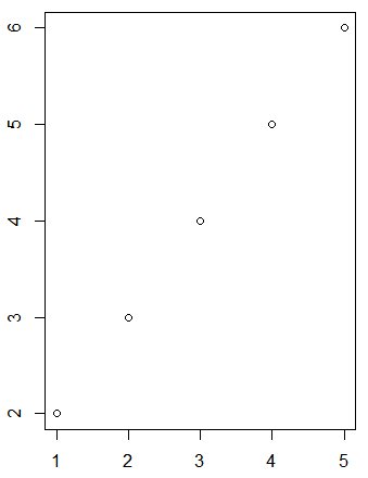
print(np.cov(np.arange(1, 6), np.arange(2, 7))) # 공분산 2.5
'''
[[2.5 2.5]
[2.5 2.5]]
'''
print(np.cov(np.arange(10, 60), np.arange(20, 70))) # 212.5
print(np.cov(np.arange(1, 6), np.arange(6, 1, -1))) # -2.5
print(np.cov(np.arange(1, 6), (3, 3, 3, 3, 3))) # 0np.cor(x, y) : 공분산
피어슨 상관계수 공식
: -1에서 1사이 값을 가진다.
: 절대값이 1에 가까울 수록 두 데이터가 관련이 높다.
: 양의 값일 경우 독립 변수가 증가할 수록 종속변수도 증가하는 데이터.
: 음의 값일 경우 독립 변수가 증가할 수록 종속변수도 감소하는 데이터.
: 선형 데이터만 사용 가능
| r (범위) | 관계 | |
| -1.0 | -0.7 | 강한 음적 선형관계 |
| -0.7 | -0.3 | 뚜렷한 음적 선형관계 |
| -0.3 | -0.1 | 약한 음적 선형관계 |
| -0.1 | 0.1 | 거의 무시될 수 있는 선형관계 |
| 0.1 | 0.3 | 약한 양적 선형관계 |
| 0.3 | 0.7 | 뚜렷한 양적 선형관계 |
| 0.7 | 1.0 | 강한 양적 선형관계 |
print(np.corrcoef(np.arange(1, 6), np.arange(2, 7)))     # 1
'''
[[1. 1.]
 [1. 1.]]
 '''
print(np.corrcoef(np.arange(10, 60), np.arange(20, 70))) # 1
print()
np.corrcoef(x, y) : 상관계수
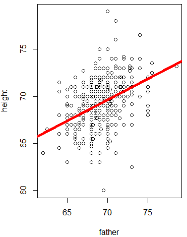
x = [8,3,6,6,9,4,3,9,3,4]
x = [800,300,600,600,900,400,300,900,300,400]
print('x 평균 :', np.mean(x)) # x 평균 : 5.5
print('x 분산 :', np.var(x))  # x 분산 : 5.45

y = [6,2,4,6,9,5,1,8,4,5]
y = [600,200,400,600,900,500,100,800,400,500]
print('y 평균 :', np.mean(y)) # y 평균 : 5.0
print('y 분산 :', np.var(y))  # y 분산 : 5.4
print()

# 두 변수 간의 관계확인
print('x, y 공분산 :', np.cov(x,y)[0, 1]) #  두 변수 간에 데이터 크기에 따라 동적
# x, y 공분산 : 5.222222222222222
print('x, y 상관계수 :', np.corrcoef(x, y)[0, 1]) # 두 변수 간에 데이터 크기에 따라 정적
# x, y 상관계수 : 0.8663686463212853

import matplotlib.pyplot as plt
plt.plot(x, y, 'o')
plt.show()
m = [-3, -2, -1, 0, 1, 2 , 3]
n = [9, 4, 1, 0, 1, 4, 9]

plt.plot(m, n, '+')
plt.show()
print('m, n 상관계수 :', np.corrcoef(m, n)[0, 1])
# m, n 상관계수 : 0.0
# 선형인 데이터만 사용 가능.
상관분석
: 두 변수 간에 상관관계의 강도를 분석
: 이론적 타당성(독립성) 확인. 독립변수 대상 변수들은 서로 간에 독립적이어야 함.
: 독립변수 대상 변수들은 다중 공선성이 발생할 수 있는데, 이를 확인
: 밀도를 수치로 표현. 관계의 친밀함을 수치로 표현.
- 어떤 상품에 대한 친밀도, 적절성, 만족도에 대한 상관관계 확인.
* relation2.py
import pandas as pd
import numpy as np
import matplotlib.pyplot as plt
plt.rc('font', family='malgun gothic')


df = pd.read_csv('../testdata/drinking_water.csv')
print(df.head(3), '\n', df.describe())
'''
   친밀도  적절성  만족도
0    3    4    3
1    3    3    2
2    4    4    4
'''
print()
print(np.std(df.친밀도))  # 0.968505126935272
print(np.std(df.적절성))  # 0.8580277077642035
print(np.std(df.만족도))  # 0.8271724742228969
print('* 공분산')
print(np.cov(df.친밀도, df.적절성))
'''[[0.94156873 0.41642182]
[0.41642182 0.73901083]]
'''
print(np.cov(df.친밀도, df.만족도))
print(np.cov(df.적절성, df.만족도))
print()
print(df.cov()) # pandas
'''
친밀도 적절성 만족도
친밀도 0.941569 0.416422 0.375663
적절성 0.416422 0.739011 0.546333
만족도 0.375663 0.546333 0.686816
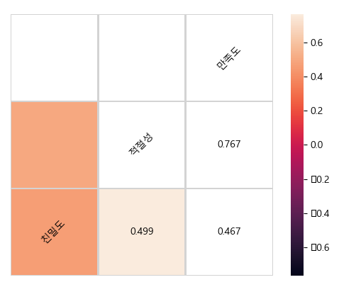
'''print('* 상관계수')
print(np.corrcoef(df.친밀도, df.적절성))
'''
[[1. 0.49920861]
[0.49920861 1. ]]
'''
print(np.corrcoef(df.친밀도, df.만족도))
print(np.corrcoef(df.적절성, df.만족도))
print(df.corr()) # pandas
'''
친밀도 적절성 만족도
친밀도 1.000000 0.499209 0.467145
적절성 0.499209 1.000000 0.766853
만족도 0.467145 0.766853 1.000000
'''
co_re = df.corr() # default : pearson
print(co_re['만족도'].sort_values(ascending=False))
'''
만족도 1.000000
적절성 0.766853
친밀도 0.467145
'''
print(df.corr())
'''
친밀도 적절성 만족도
친밀도 1.000000 0.499209 0.467145
적절성 0.499209 1.000000 0.766853
만족도 0.467145 0.766853 1.000000
'''
print(df.corr(method='pearson')) # 변수가 등간/비율 척도. 정규성을 따를 경우 사용.
print(df.corr(method='spearman')) # 변수가 서열척도. 정규성을 따르지 않을 경우 사용.
print(df.corr(method='kendall'))# 시각화
df.plot(kind="scatter", x='만족도', y='적절성')
plt.show()
from pandas.plotting import scatter_matrix
attr = ['친밀도', '적절성', '만족도']
scatter_matrix(df[attr], figsize=(10, 6)) # 히스토그램
plt.show()
# heatmap : 밀도를 색으로 표현
import seaborn as sns
sns.heatmap(df.corr())
plt.show()
# hitmap에 텍스트 표시 추가사항 적용해 보기
corr = df.corr()
# Generate a mask for the upper triangle
mask = np.zeros_like(corr, dtype=np.bool)  # 상관계수값 표시
mask[np.triu_indices_from(mask)] = True
# Draw the heatmap with the mask and correct aspect ratio
vmax = np.abs(corr.values[~mask]).max()
fig, ax = plt.subplots()     # Set up the matplotlib figure

sns.heatmap(corr, mask=mask, vmin=-vmax, vmax=vmax, square=True, linecolor="lightgray", linewidths=1, ax=ax)

for i in range(len(corr)):
    ax.text(i + 0.5, len(corr) - (i + 0.5), corr.columns[i], ha="center", va="center", rotation=45)
    for j in range(i + 1, len(corr)):
        s = "{:.3f}".format(corr.values[i, j])
        ax.text(j + 0.5, len(corr) - (i + 0.5), s, ha="center", va="center")
ax.axis("off")
plt.show()
공공 데이터(외국인 관광객의 국내 관광지 입장자료로 상관관계 분석)
import json
import matplotlib.pyplot as plt
plt.rc('font', family='malgun gothic')
import pandas as pd
def Start():
# 서울 관광지 정보
fname = '서울특별시_관광지.json'
jsonTP = json.loads(open(fname, 'r', encoding='utf-8').read()) # str => json
#print(jsonTP)
tour_table = pd.DataFrame(jsonTP, columns=('yyyymm', 'resNm', 'ForNum')) # 년월, 관광지명, 입장객수
tour_table = tour_table.set_index('yyyymm')
print(tour_table)
'''
resNm ForNum
yyyymm
201101 창덕궁 14137
201101 운현궁 0
'''
resNm = tour_table.resNm.unique()
print('resNum :', resNm[:5]) # 5개 샘플. resNum : ['창덕궁' '운현궁' '경복궁' '창경궁' '종묘']
# 중국인 관광정보
cdf = '중국인방문객.json'
jdata = json.loads(open(cdf, 'r', encoding='utf-8').read())
#print(jdata)
china_table = pd.DataFrame(jdata, columns=('yyyymm', 'visit_cnt')) # 년월, 방문객수
china_table = china_table.rename(columns={'visit_cnt':'china'})
china_table = china_table.set_index('yyyymm')
print(china_table)
'''
china
yyyymm
201101 91252
201102 140571
201103 141457
'''
# 일본인 관광정보
jdf = '일본인방문객.json'
jdata = json.loads(open(jdf, 'r', encoding='utf-8').read())
#print(jdata)
japan_table = pd.DataFrame(jdata, columns=('yyyymm', 'visit_cnt')) # 년월, 방문객수
japan_table = japan_table.rename(columns={'visit_cnt':'japan'})
japan_table = japan_table.set_index('yyyymm')
print(japan_table)
'''
japan
yyyymm
201101 209184
201102 230362
'''
# 미국인 관광정보
udf = '미국인방문객.json'
jdata = json.loads(open(udf, 'r', encoding='utf-8').read())
#print(jdata)
usa_table = pd.DataFrame(jdata, columns=('yyyymm', 'visit_cnt')) # 년월, 방문객수
usa_table = usa_table.rename(columns={'visit_cnt':'usa'})
usa_table = usa_table.set_index('yyyymm')
print(usa_table)
'''
usa
yyyymm
201101 43065
201102 41077
'''
all_table = pd.merge(china_table, japan_table, left_index=True, right_index=True)
all_table = pd.merge(all_table, usa_table, left_index=True, right_index=True)
print(all_table)
'''
china japan usa
yyyymm
201101 91252 209184 43065
201102 140571 230362 41077
'''
r_list = []
for tourPoint in resNm[:5]:
r_list.append(SetScatterGraph(tour_table, all_table, tourPoint))
#print(r_list)
r_df = pd.DataFrame(r_list, columns=['관광지명', '중국','일본','미국'])
r_df = r_df.set_index('관광지명')
print(r_df)
'''
중국 일본 미국
관광지명
창덕궁 -0.058791 0.277444 0.402816
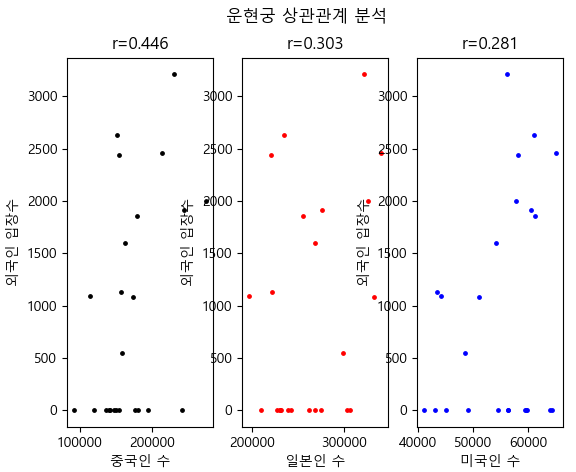
운현궁 0.445945 0.302615 0.281258
경복궁 0.525673 -0.435228 0.425137
창경궁 0.451233 -0.164586 0.624540
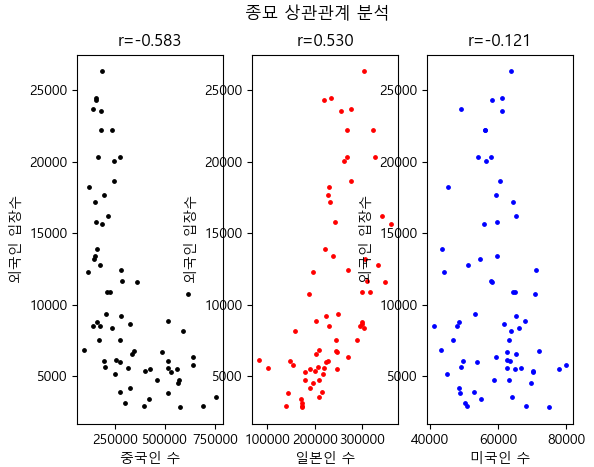
종묘 -0.583422 0.529870 -0.121127
'''
r_df.plot(kind='bar', rot=60)
plt.show()
def SetScatterGraph(tour_table, all_table, tourPoint):
    tour = tour_table[tour_table['resNm'] == tourPoint]
    #print(tour)
    merge_table = pd.merge(tour, all_table, left_index=True, right_index=True)
    print(merge_table) # 광광지 자료중 앞에 5개만 참여
    '''
               resNm  ForNum   china   japan    usa
    yyyymm
    201101   창덕궁   14137   91252  209184  43065
    201102   창덕궁   18114  140571  230362  41077
    '''
    # 시각화 + 상관관계
    fig = plt.figure()
    fig.suptitle(tourPoint + ' 상관관계 분석')

    plt.subplot(1, 3, 1)
    plt.xlabel('중국인 수')
    plt.ylabel('외국인 입장수')
    lamb1 = lambda p:merge_table['china'].corr(merge_table['ForNum'])
    r1 = lamb1(merge_table)
    print('r1 :', r1)
    plt.title('r={:.3f}'.format(r1))
    plt.scatter(merge_table['china'], merge_table['ForNum'], s=6, c='black')

    plt.subplot(1, 3, 2)
    plt.xlabel('일본인 수')
    plt.ylabel('외국인 입장수')
    lamb2 = lambda p:merge_table['japan'].corr(merge_table['ForNum'])
    r2 = lamb2(merge_table)
    print('r2 :', r2)
    plt.title('r={:.3f}'.format(r2))
    plt.scatter(merge_table['japan'], merge_table['ForNum'], s=6, c='red')

    plt.subplot(1, 3, 3)
    plt.xlabel('미국인 수')
    plt.ylabel('외국인 입장수')
    lamb3 = lambda p:merge_table['usa'].corr(merge_table['ForNum'])
    r3 = lamb3(merge_table)
    print('r3 :', r3)
    plt.title('r={:.3f}'.format(r3))
    plt.scatter(merge_table['usa'], merge_table['ForNum'], s=6, c='blue')

    plt.show()
    return [tourPoint, r1, r2, r3]
    '''
        r1 : -0.05879110406006314
    r2 : 0.2774443570141011
    r3 : 0.4028160633050156
    r1 : 0.44594488384450376
    r2 : 0.30261521828798604
    r3 : 0.2812576500158649
    r1 : 0.5256734293511215
    r2 : -0.43522818613412334
    r3 : 0.4251372638704492
    r1 : 0.4512325398089607
    r2 : -0.16458589402253013
    r3 : 0.6245403780269381
    r1 : -0.5834218986767473
    r2 : 0.5298702802205213
    r3 : -0.1211266682929496
    '''
if __name__ == '__main__':
    Start()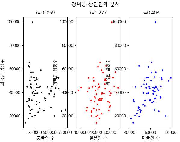


'BACK END > Deep Learning' 카테고리의 다른 글
| [딥러닝] 단순선형 회귀, 다중선형 회귀 (0) | 2021.03.11 |
|---|---|
| [딥러닝] 선형회귀 (0) | 2021.03.10 |
| [딥러닝] 이항검정 (0) | 2021.03.10 |
| [딥러닝] ANOVA (0) | 2021.03.08 |
| [딥러닝] T 검정 (0) | 2021.03.05 |